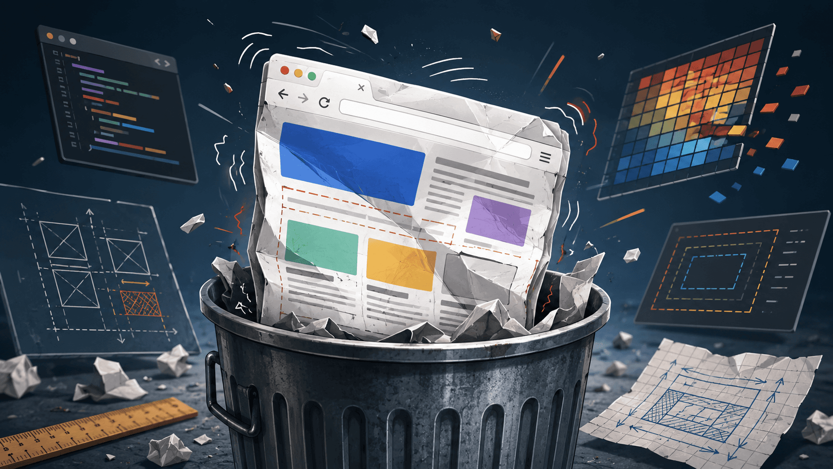
Mind Blowing Cut Page Animation in React
We’re going to fake a page getting cut into vertical strips, then we’ll yank those strips up and down like blinds, revealing a brand-new scene underneath (in our case: a simple light-blue background).
https://codesandbox.io/embed/tfv76t?view=preview
The Concept: Paper Over a Picture
Imagine a white sheet of paper with text on it, placed over a colorful picture.
You take a blade and make vertical cuts through the paper.
Then you lift alternating strips — some up, some down — revealing the picture underneath.
That’s exactly what this animation does:
Cutting phase: vertical lines animate in, simulating “cuts”
Reveal phase: the “cut” strips slide away (up/down alternating)
Scene phase: the new scene is fully visible
The Wrap That Makes It Possible
This line is the whole magic trick:
<AnimationOverlay isActive={isAnimationActive}>
  {content}
</AnimationOverlay>
What it means
AnimationOverlayis a wrapper component.It receives your whole page (
content) aschildren.It decides how to render that page depending on the animation phase:
render normally (idle)
render the page + cutting lines (cutting)
render multiple clipped “slices” of the page (revealing)
render only the new scene (scene)
It’s basically a director standing behind the camera shouting:
“Okay, show the page… NOW cut it… NOW rip it apart… NOW show the scene.”
AnimationOverlay: The Orchestrator
1) idle
Nothing fancy.
Just render children like normal.
if (!isActive || phase === "idle") return <>{children}</>;
2) cutting
We render:
the page (children)
plus
AnimatedLinesin “cutting mode”
{children}
<AnimatedLines phase="cutting" onComplete={handleCuttingComplete} />
AnimatedLines draws vertical lines that slide into place, like blades.
When the last line finishes its animation, it calls onComplete, and the overlay moves to…
3) revealing
We render:
AnimatedLinesin “revealing mode”and pass the same children again
<AnimatedLines phase="revealing" onComplete={handleRevealComplete}>
  {children}
</AnimatedLines>
This is the big trick: in reveal mode, AnimatedLines doesn’t draw lines —
it creates multiple vertical slices of your page and animates them away.
Then we move to…
4) scene
We stop rendering the page at all.
Only the background “scene” remains.
In your demo it’s just light-blue, full screen
AnimatedLines: Two Personalities in One Component
AnimatedLines has two completely different behaviors depending on phase.
A) Cutting phase: vertical blades
We generate equal X positions across the screen:
const generateEqualCutPositions = (count, edgePaddingPct = 6) => ...
This creates a list like:
6%
14%
22%
...
94%
So the cuts are evenly spaced.
Then we render each cut as a <div class="cut-line"> positioned by left: ${xPos}%.
We also alternate the direction:
const fromTop = i % 2 === 0;
So one line comes from the top, the next from the bottom, etc.
It looks more “alive” than all lines falling from the same direction.
To know when we’re done, we count animations ending:
const handleCutEnd = () => setCutsComplete((prev) => prev + 1);
When cutsComplete matches number of lines, we call onComplete() and advance to reveal.
B) Reveal phase: slicing the page into strips
This is the sneaky part.
We take all cut positions and build “sections”:
const createSections = (cutPositions) => {
  const all = [0, ...cutPositions, 100];
  return all.slice(0, -1).map((left, i) => ({
    left,
    width: all[i + 1] - left,
  }));
};
So if your cuts are at 10%, 30%, 50%...
Then sections become:
0% → 10%
10% → 30%
30% → 50%
etc…
Each section renders the entire page again… but only shows its own slice.
That’s how we “cut” the page without actually cutting it.
The Clip-Path Trick
Each section uses:
clipPath: `inset(0 ${right}% 0 ${left}%)`
Why clip-path?
Because we want each slice to show only a vertical segment of the page.
We could try:
cropping with overflow + nested wrappers
manually splitting layout
rendering separate content
…but clip-path is clean: it masks the element visually while keeping layout intact.
Why inset() specifically?
clip-path: inset(top right bottom left) is perfect for “rectangular slicing”.
We want:
top = 0
bottom = 0
left = start of slice
right = everything beyond slice
So each slice becomes:
“show only this vertical window”
“hide the rest”
And because we define it in percentages, it scales nicely with viewport size.
This is why your reveal phase is possible without rewriting the page layout.
The “Goes Up / Goes Down” Alternation
For each slice:
const goesUp = i % 2 === 0;
"--direction": goesUp ? "-1" : "1"
Then CSS does:
transform: translateY(calc(var(--direction) * 100vh));
So slices alternate:
slice 0 → up
slice 1 → down
slice 2 → up
slice 3 → down
That alternating motion is what sells the illusion that the page was “cut”.
If they all went the same direction, it would feel like a normal page slide transition.
styles.css: Performance Corner (The Good Stuff)
will-change: transform;
You’ll see this on .cut-line and .section-reveal.
What it tells the browser:
“Hey, I’m about to animate
transform. Please prepare for that.”
Browsers can then:
promote the element to its own compositor layer
reduce paint work during animation
avoid stutter when the animation starts
It’s basically pre-warming the engine.
Important caveat: don’t sprinkle will-change everywhere.
It consumes memory if abused.
Here it’s used on a few animated elements, so it’s a good fit.
Why we animate with transform: translateY(...)
We deliberately avoid animating layout properties like top, left, height.
Layout properties cause:
layout recalculation
paint
potential jank
Transforms are compositor-friendly:
they usually run on the GPU
no layout thrashing
smoother on weaker devices
That’s why our keyframes are:
@keyframes section-slide {
  0% { transform: translateY(0); }
  100% { transform: translateY(calc(var(--direction) * 100vh)); }
}
We’re pushing the slice off-screen by exactly one viewport height.
The section-slide animation
animation: section-slide var(--reveal-duration, 3000ms)
  cubic-bezier(0.16, 1, 0.3, 1) forwards;
Breakdown:
section-slide
the keyframes that move the slicevar(--reveal-duration, 3000ms)
uses a CSS variable if provided, otherwise defaults to 3000mscubic-bezier(0.16, 1, 0.3, 1)this easing is “fast start, slow settle” it makes the animation feel physical, not linear / robotic (it’s like: rip it hard, then let it drift)forwards
keeps the final transform applied otherwise, the strips would snap back when the animation ends
(and that would destroy the illusion instantly)
A Small Line With Big Impact: contain: strict
At some point in the animation code you’ll see something like this:
<div style={{ contain: "strict" }}>
  {/* animated content */}
</div>
This single CSS property can dramatically reduce the amount of work the browser has to do during complex animations.
What contain Actually Means
contain is a CSS performance hint. It tells the browser:
“Everything inside this element is self-contained.
Nothing in here affects the outside world.”
In other words:
layout changes inside won’t affect layout outside
paint changes inside won’t require repainting ancestors
style recalculations are isolated
When you write:
contain: strict;
You are enabling all containment types at once:
contain: layout paint style size;
This is the strongest possible form of containment.
Why This Matters for Animations
During the reveal phase, we do something fairly aggressive:
render multiple copies of the entire page
clip each copy into vertical slices
animate every slice simultaneously
move them off-screen with transforms
Without containment, the browser has to consider the possibility that:
moving one slice might affect layout elsewhere
painting one slice might invalidate large areas
style changes might cascade upward
Even if it doesn’t actually happen, the browser still has to check.
That checking is where performance dies.
contain: strict tells the browser:
“Stop checking.
This subtree is sealed.”
What the Browser Can Skip
With contain: strict, the browser is free to:
Skip layout propagation
Moving slices won’t trigger reflows outside the containerLimit paint invalidation
Only the contained area needs repaintingIsolate style recalculation
CSS changes don’t bubble up the DOM tree
This is especially important when:
you animate many elements at once
those elements are visually large
you duplicate content (like we do for slices)
Why This Pairs Perfectly With transform
Our animation already follows best practices:
only animates
transformandopacityavoids layout-affecting properties
uses
will-change: transform
contain: strict completes the picture.
Think of it like this:
transformkeeps animations on the compositorwill-changepreps the GPUcontainlimits the blast radius
Together, they prevent:
layout thrashing
unnecessary repaints
accidental main-thread work
When Not to Use contain: strict
This is not a free optimization.
You should not use contain: strict when:
the element’s size depends on its children
children need to affect surrounding layout
you rely on percentage sizing relative to ancestors
positioned elements need to escape the container
In our case:
the animation container is full-screen
its size is fixed
its contents are visually isolated
So it’s a perfect fit.
Mental Model
A good way to think about contain: strict:
“This is a mini universe.
Physics inside don’t leak out.”
For animation-heavy UIs, that’s exactly what you want.
Why This Matters More Than You Think
Most animation jank doesn’t come from bad easing curves.
It comes from:
browsers doing extra work you didn’t ask for
layout and paint costs you didn’t realise you triggered
contain: strict is you telling the browser:
“Relax. I’ve got this under control.”
And when paired with transform-based animations, it’s one of the cleanest performance wins you can get in modern CSS — especially in animations that look way more expensive than they actually are.